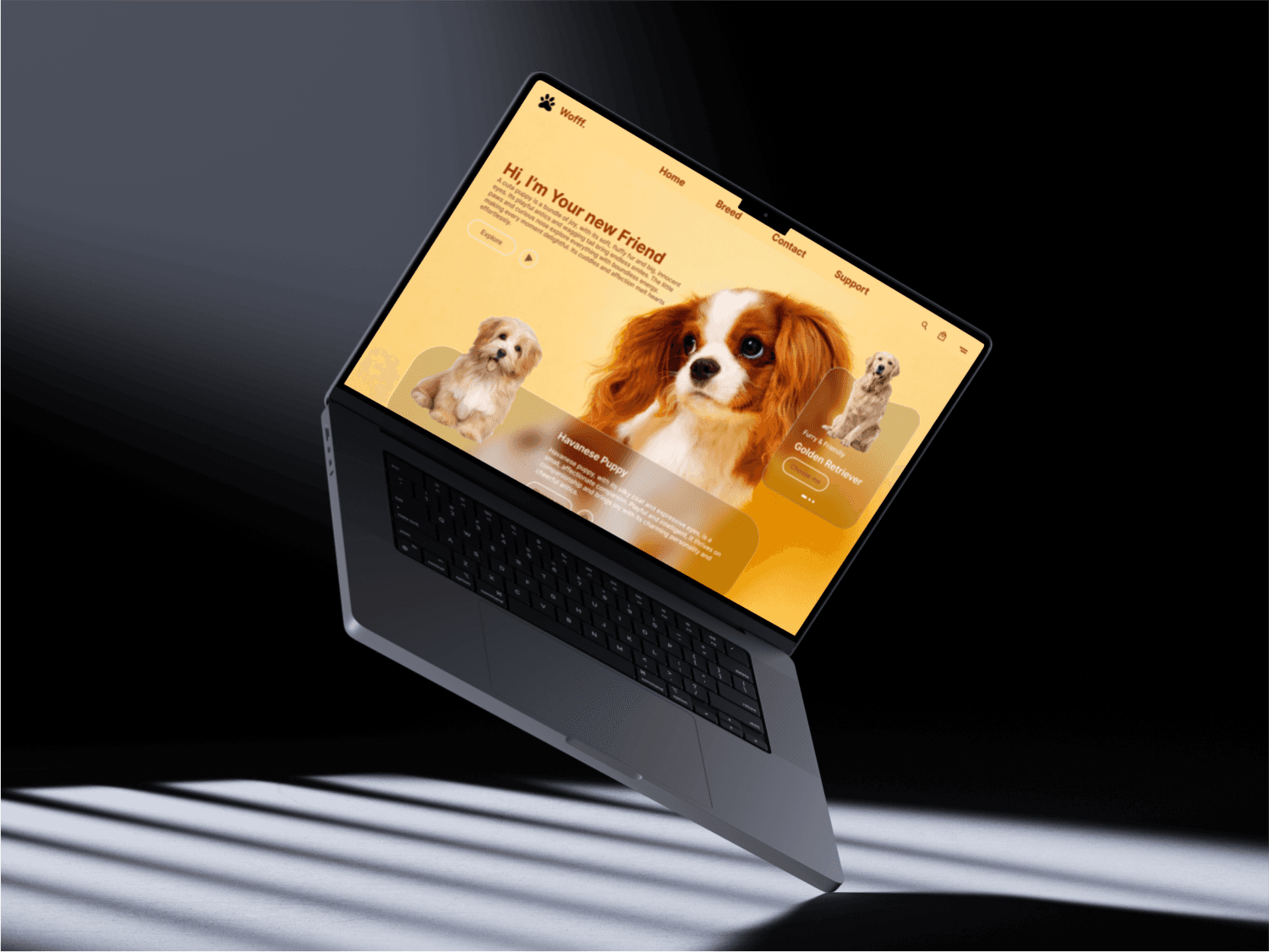
Wofff Landing Page
The Wofff Landing Page was designed as a clean, modern entry point for a hypothetical brand or service. The objective was to create a compelling, visually appealing interface that communicates the brand’s tone and value proposition clearly.
Client
Woff Pets
Client
Woff Pets
Services
Landing Page UI
Services
Landing Page UI
Timeline
2 week
Timeline
2 week
To design a minimal, engaging, and conversion-focused landing page with strong visual hierarchy and clear messaging.
⸻
Design Breakdown
Hero Section • Bold typography immediately grabs attention. • Clean, centered layout with strong contrast between background and text. • Primary CTA is prominent and clear – this helps drive user action instantly.
Visual Aesthetic • The use of minimal colors and whitespace creates a premium and spacious feel. • Rounded shapes and smooth gradients convey a modern and friendly brand. • Fonts are carefully chosen for readability and aesthetic alignment with the brand voice.
Layout & Flow • Simple scroll with clear section breaks. • Visual elements (e.g., image placements, illustrations) support the content without overpowering it. • Mobile responsiveness considered via scaling behavior.
Balancing minimalism with enough information to engage users.
Ensuring the design looked equally appealing on both desktop and mobile resolutions.